Alert
Alerts are used to draw attention of the user, to certain information like process completion/success/failure/information without interrupting the usual work flow
Alerts without closing buttons
Here we have 6 types of alerts, each of them serving a different purpose. Each alert box has a basic skelton (the structure, padding, and margins) and a skin (color).
You can access the skelton alert box by adding an "alert" class and following it with the type of skin (color) you may require (say "alert-success").
To use links in alert box, use the
To use links in alert box, use the
.alert-link utility class to provide links with colors matching to the alert box.
A simple primary alert with an example link. Give it a click if you like.
A simple secondary alert—check it out!
A simple success alert—check it out!
A simple danger alert—check it out!
A simple warning alert—check it out!
A simple info alert—check it out!
Alert with a close button
Alert can also have a close button to close the alert.Below is the demo.
A simple warning alert.
Javascript plugin
You can use the below JS plugin to close the alert. This removes the alert completly from the document.
Avatar
Avatars are mainly used to display a user's profile picture on any application, they supports either image or text content.
Image Avatar
Mantra UI provide avatars in 5 different sizes.To use avatar add
To make the image round and responsive add
.avatar to a div and
a required size indicator using any of the size classes eg. .avatar-xl, .avatar-lg, .avatar-md
.avatar-sm, .avatar-xs.
To make the image round and responsive add
.img-responsive, .img-round.
text avatar
You can use avatars with text, eg. name initials, just add
.avatar-text
as shown in the demo examples and code below.
KP
KP
KP
KP
KP
Badge
Badges are small status descriptors for UI elements.
A badge consists of a small circle, typically containing a number or other short set of characters, that appears in proximity to another object.
They are visual cues of some information related to the UI element they appear on. Eg. Status of a user (active, inactive, idle) could be depicted using a badge
on the user avatar.
Badge on Avatar
Mantra UI provide badges for all 5 avatar sizes.Badge can be added to an avatar, by using a parent
To give the badge a color indicator of a particular status, use one of the three
.badge-container
and putting the .avatar and .status-badge as child elements of the parent.
To give the badge a color indicator of a particular status, use one of the three
.status-active, .status-idle, .status-inactive classes.
Copy and use the demo code below to get up and running with avatar badges.
KP
Badge on Icon
Badge on icons can be particulary useful for displaying some sort of count related to the icon representing the UI element.
Mantra UI provides three different sized badges for icons of large , medium and small size.
The code snippent below demonstrates the usage. Icon size is changed using
.icon-sm, .icon-md, .icon-lg.
3
3
3
Button
Buttons are generally used for call to action. Mantra UI provides various buttons
for different states and uses. Have a look at the demo and code below
Solid Buttons
Solid buttons have a solid background color, take a look at what types are available and
choose according to your needs.
Copy and use the demo code below to get up and running with primary buttons.
Outline Buttons
Outline buttons follow a similar color scheme as the solid buttons, with background color being white,
and text and border colors following from classes given.
Disabled Buttons
To make any button disabled, add the disabled attribute to the button element,as demonstrated below.
Floating Action Buttons
Floating action buttons are available in two sizes large and medium,
which can be accessed by adding
.btn-fab-lg and .btn-fab-md
classes respectively
Card
Mantra UI provides the card component in two variants vertical and horizontal,
each variant can use badges, card dismiss button, or card overlay as demonstrated below.
Vertical Card
Copy the demo code below, and edit it to get up and running with a vertical card component for your project.
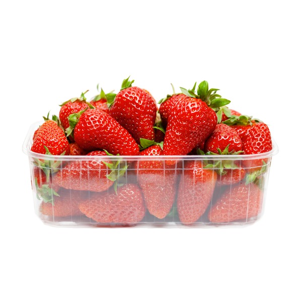
Strawberries
1 kg container
₹500 ₹400 (Save 20%)
New
Strawberries
1 kg container
₹500 ₹400 (Save 20%)
Horizontal Card and Card with overlay
Cards an have an overlay which disables any access to the contents and buttons in the card.
New
Strawberries
1 kg container
₹500 ₹400 (Save 20%)
Strawberries
1 kg container
₹500 ₹400 (Save 20%)
Image
Mantra UI provides the card component in two variants vertical and horizontal,
each variant can use badges, card dismiss button, or card overlay as demonstrated below.
Responsive Image
Image can be made responsive, by adding the
.img-responsive
class which makes the image take up 100% of the parent container width, and the height adjusts to maintain
the aspect ratio.

Round Image
A round image can be obtained by adding img-responsive and img-round classes to an img tag,
this image takes width and height according to the parent container.
Ensure that the parent image container has same height and width.
Input
Input fields can have different color schemes for visually aiding
in representing validation status of input field values.
Input variations
Add a
.form-field class, and then
add or remove classes like .success-border, error-border as needed.
Modal
Modals can be used to grab user's attention to some important information, that
may or may not require user action. The modal overlays over the complete webpage, and needs to
be dismissed by performing some action like closing using close button or submitting a form.
Demo Modal
Copy the following HTML snippet and JS snippet and edit the modal
content according to use case.
Modal Heading
Typography
Mantra UI provides different classes for headings, paragraphs and alignment
Copy the code from snippets to get the effects demonstrated here.
Headings
Add any class from
.h1 to .h6, or directly use the default h1 to h6 tags
to get the demonstrated headings.
h1. Mantra heading
h2. Mantra heading
h3. Mantra heading
h4. Mantra heading
h5. Mantra heading
h6. Mantra heading
Paragraphs
Add a
.p-lg, .p-md, .p-rg, .p-sm or .p-xs class,
to get the text to look like as shown.
p-large. This is a large paragraph text
p-medium. This is a medium paragraph text
p-regular. This is a regular paragraph text
p-small. This is a small paragraph text
p-extra-small. This is a extra small paragraph text
Alignment
Use
.text-left, .text-center, .text-right
to align the text accordingly.
Left Aligned
Center Aligned
Right aligned
Snackbar
Snackbars or toasts push notifications to the website visitors. They can also act as alerts.
Normal and Stacked snackbar
The snackbars fetaured in Mantra UI have a width set to max-content, which you can modify
if you wish. Stacked snackbars are preferred, if the notification message length is large.
Demo Snackbar HTML
Demo Snackbar JS
Grid
Grid layouts are built using the inbuilt CSS grid, and can be used to quickly set up
views using a parent and children containers.
Side by side grid (50:50)
Add a
.grid-50-50 class to the parent div
and add two child containers to get the expected result
This text container
takes 50% of parent
Side by side grid (30:70)
Add a
.grid-30-70 class to the parent div
and add two child containers to get the expected result
This text container
takes 70% of parent
Side by side grid (70:30)
Add a
.grid-70-30 class to the parent div
and add two child containers to get the expected result